VacúnateRD
Los productos digitales del plan nacional de vacunación de la República Dominicana, diseñados en plena emergencia sanitaria.
Sector
Salud pública · Gobierno
Rol
UX Designer
Periodo
2021 – 2024
Equipo
Única diseñadora UX/UI
Herramientas
Adobe XD, Figma, Trello, Miro
Lectura
7 min
En resumen
Diseñé los productos digitales del plan nacional de vacunación: registro y citas, centros de vacunación, certificado digital, backoffice y CMS.
El certificado con código QR se lanzó oficialmente en noviembre de 2021, cuando el país había aplicado más de 13 millones de dosis a través de más de 1,200 centros.
Diseñé la propuesta del certificado a partir de los estándares internacionales de validación vigentes, lo que permitió que se reconociera fuera del país, con compatibilidad para Apple Wallet y Wallet Pass.
En la versión 2.0 el producto cambió de destinatario: dejó de ser una herramienta ciudadana para convertirse en un sistema de gestión para vacunatorios y el Ministerio de Salud.
01
La escala
The National Vaccination Plan launched on February 15, 2021. Over the following months, the Dominican Republic deployed more than 1,200 vaccination centers and, by November 3, 2021, had administered 13,362,571 doses: 6,760,871 people had received a first dose and 5,359,699 had completed their vaccination schedule.
Source: Presidency of the Dominican Republic, November 5, 2021.
Designing at that scale during a public health emergency meant that every point of friction was multiplied across millions of people, and the margin for error was minimal: a poorly designed form could translate into lines, phone calls, and overwhelmed vaccination centers.
02
El problema, dicho por los usuarios
The press release announcing the appointment platform accumulated dozens of public comments from citizens on the same day it launched, in March 2021.
"I can't find the appointment registration platform."
"I can't select the province where I live or the municipality."
"I made an appointment for my parents 48 hours ago and they still haven't told me where or when it will be."
"Can an adult over 70 who has limited mobility make an appointment to be vaccinated at home?"
Public comments collected from press coverage of the launch, March 2021. Names omitted.
Four different product problems, expressed by real users on day one: discoverability, geographic field validation, lack of feedback after submission, and a use case —home vaccination— that the system did not support.
This is the kind of evidence you would normally have to go out and look for. Here, it was already public.
03
Restricciones
This was not like designing a commercial product. The timeline was driven by the epidemiological curve, not a roadmap.
The users were, quite literally, the country's entire adult population: from people over 70 with little digital experience to younger adults with expectations shaped by modern apps. There was no single target user to optimize for.
On top of that came institutional interoperability —identity verification against the Electoral Roll of the Central Electoral Board, coordination with the Ministry of Public Health— and the requirement for the certificate to be valid outside the country, which introduced non-negotiable specifications.
For much of the project, I was the company's only UX/UI designer.
04
Decisiones de diseño
The certificate: three formats, three different constraints
Format | Constraint |
|---|---|
Screen | Legible at any size, with the QR code always accessible |
Paper (printed PDF) | Independent of color and readable on a home printer |
Digital wallet | Subject to the rigid format requirements of Apple Wallet and Wallet Pass |
The key decision was to treat paper as a first-class format, not a degraded version of the digital one.
In a country where part of the population did not have a phone capable of supporting a digital wallet, the printable PDF was not a compromise. For many people, it was the primary way they would use the certificate.
That affected the hierarchy, contrast, and placement of the QR code.
The QR code as a trust decision
The QR code was not added for the sake of looking modern. It solved three problems at once: validation within seconds at an access point, verification against an authoritative source instead of visual inspection of a paper card, and fraud prevention —because the document was linked to a verifiable record, a copy could no longer be used on its own.
The choice of standard was not mine. I received the international specifications in force at the time, along with the guidelines defined for the Dominican certificate. My role was to turn those requirements into a design that was legible, printable, and usable at a checkpoint.
Designing within a closed specification has its own difficulty. The standard defines which data must appear and how it should be structured; it does not tell you how to make a seventy-year-old understand what they are looking at.
When the user changes, the product changes
Version 2.0 was a different product with the same name.
It stopped being citizen-facing and became a management tool for vaccination centers and the Ministry of Public Health, covering the full vaccination schedule from birth rather than focusing only on COVID-19.
Design criterion | 1.0 · Citizen | 2.0 · Vaccination staff |
|---|---|---|
Frequency of use | Once or twice | Dozens of times a day |
Priority | Clarity for first-time users | Speed for experienced users |
Cost of error | Low, reversible | High: official health record |
Context | At home, with time | Vaccination center, with a queue waiting |
The most complex part of the work was identity. I designed differentiated flows for adults with a national ID, minors with a national ID, foreign minors with a foreign guardian, and searches for citizens who had already been registered, as well as a dedicated flow for other types of identification.
No one should be left out of registration because they don't fit the standard case. In a public health system, an edge case is not an edge case: it is a person who needs a vaccine.
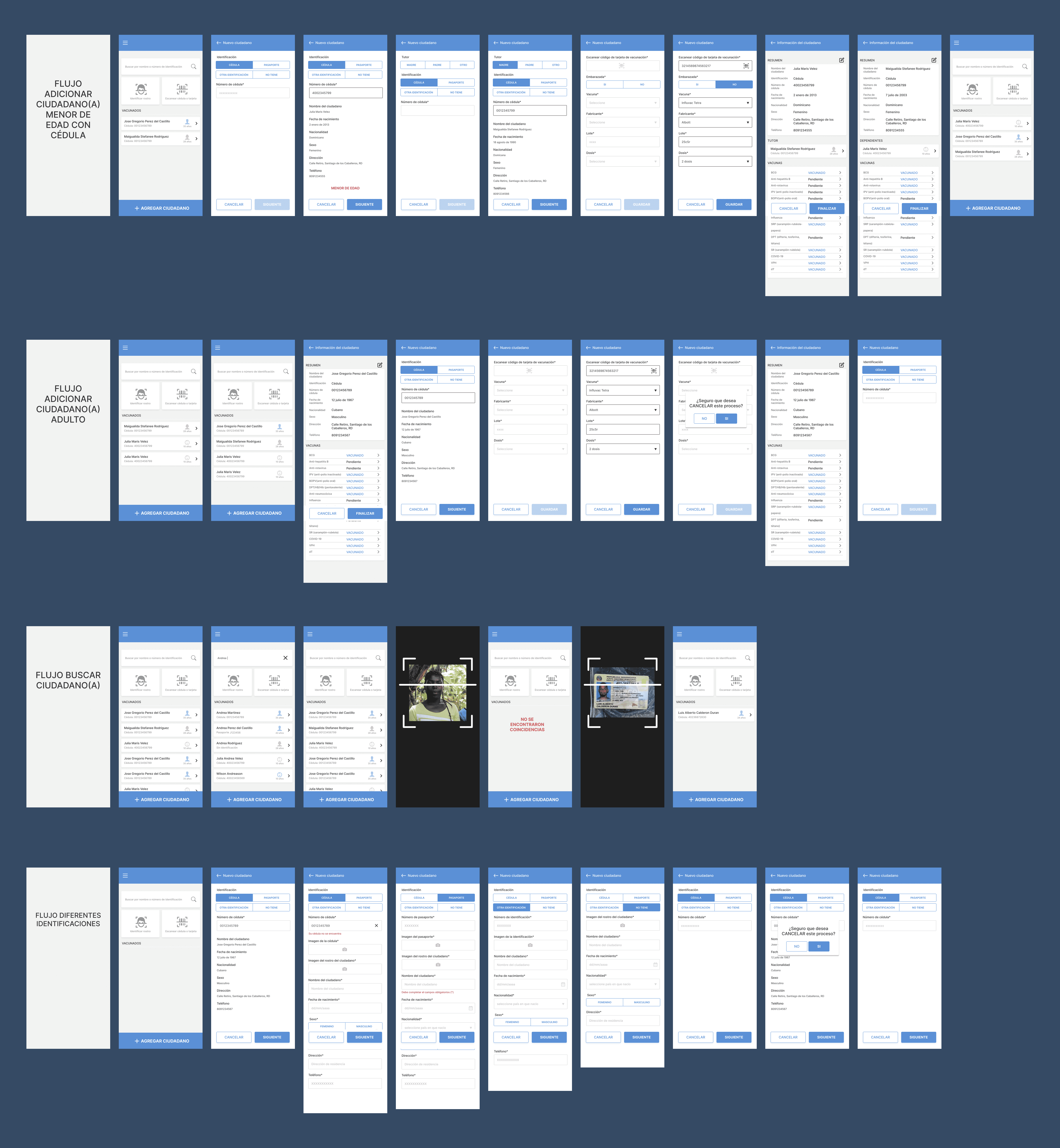
Real complexity, solved through structure. Each additional branch represented someone who, without it, would have been left out of the national health registry.
05
Resultados
What can be publicly verified: the QR-based digital certificate was officially presented on November 5, 2021, available for download as a PDF or image and configured to be stored in Apple Wallet and Android Wallet Pass.
The official communication described it as a tool that would “remain in constant evolution according to international guidelines and standards.”
The appointment platform had been activated on March 3, 2021, with a phased rollout across regions.
06
Aprendizajes
Paper is not the backup plan
Designing the printed certificate with the same care as the screen version had the greatest impact on real-world coverage.
Designing for the infrastructure people actually have, rather than the infrastructure we assume they have, is an equity decision before it is a usability decision.
Designing within a closed specification is a skill of its own
The international standard came predefined: I did not choose which data had to appear or how it was structured.
What I could control was making that rigid content understandable to anyone.
The constraint did not eliminate the design work; it concentrated it.
An edge case is a person
In version 2.0, every additional identification flow represented someone who, without it, would have been left out of the national health registry.
Being the only designer forces you to prioritize
Sustaining the design function on my own in a project of this scale taught me to distinguish between what needs to be solved well and what simply needs to be solved.