GIZMO
A year designing a product ecosystem for a company that did not allow testing with its end users.
Industry
Solar energy · B2B
Role
UX/UI Designer
Period
Aug 2024 – Jul 2025
team
UI Designer, development, stakeholder
TOols
Figma, Zoho
Reading time
6 min
In summary
Hytech Nexo was building GIZMO, its own ecosystem of applications, to stop relying on third-party tools.
I designed and redesigned several products: an energy audit form, a door-to-door sales tool, a calendar, sales proposals, and the corporate website.
The company did not allow testing with end users. Validation happened through weekly review cycles with the business stakeholder and development team.
This case is about maintaining design judgment when access to users is blocked —and about what you gain and what you lose with that model.
01
Context
Hytech Nexo is the software development arm, based in Santiago, of Hytech Home, a U.S.-based company specializing in solar panels, thermal sealing, HVAC, and geothermal solutions.
GIZMO was its move toward building in-house the tools the business used every day instead of depending on third-party products.
GIZMO's users were not external customers but the company's own employees: door-to-door salespeople, energy audit technicians, and operations teams, all based in the United States.
That is where the project's central constraint came from: the users existed, they were identified, and they used the product every day —but access to them was not authorized.
02
The Method Problem
Designing without users does not mean designing blindly. It means designing with lower-quality sources of information —and being explicit about it.
What we did have was the business stakeholder, who provided requirements every week and knew the operation firsthand. But, like any intermediary, he communicated what he believed the problem was, not necessarily what the user was experiencing.
We also had the development team, who understood the technical constraints and the system's actual behavior; previous research from interviews, surveys, and competitive analysis; and established patterns from comparable products, which gave us a defensible reference when we had no first-hand evidence.
The methodological decision was to make the confidence level of each decision explicit instead of presenting them as equally well supported: what was backed by evidence, what came from stakeholder judgment, and what was based on industry convention.
03
Products
Doorknocker · Field Sales
A supporting application for door-to-door salespeople.
Each salesperson arrives with a list of leads that can be viewed in two ways: on a map, to group leads by area and plan a route, or as a list, with the full profile of each contact.
They can also add new leads manually while already in the field and update each lead's status based on how the visit went.
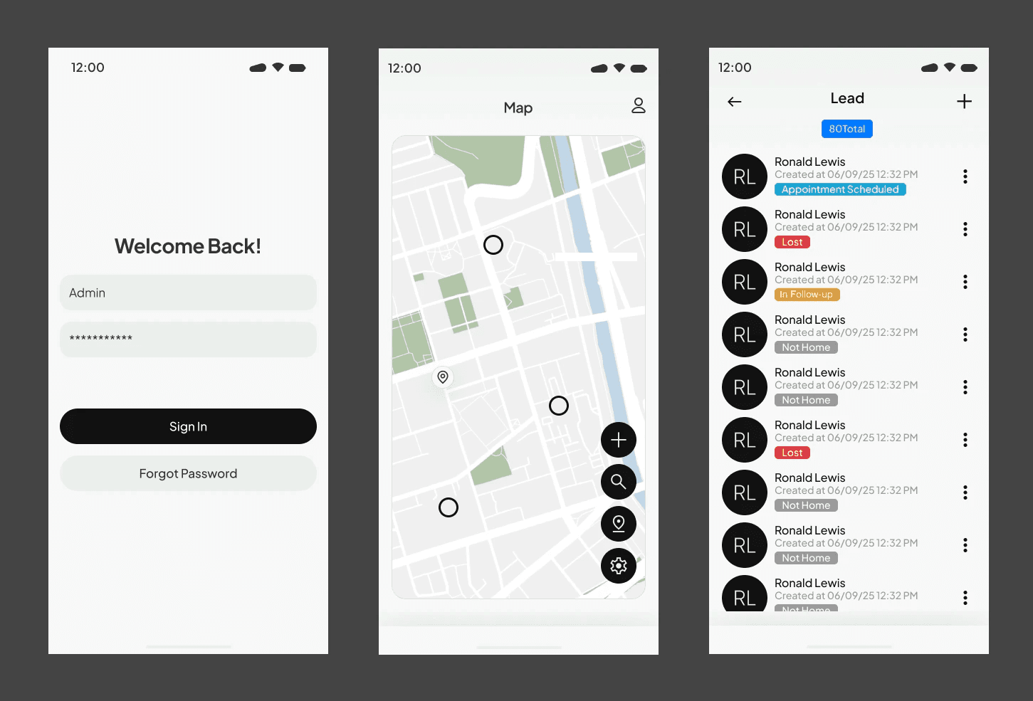
Two views of the same data. The map helps decide where to go; the list helps decide who to talk to. Each lead's status is updated after the visit.
The Most Debated Decision: Filters or Search?
Almost every discussion in the project revolved around screen structure. The most recurring one was whether the lead list needed filters or whether a search field would be enough.
It was not an aesthetic discussion.
A salesperson standing outside with a phone in one hand is rarely looking for a specific person by name. They need to answer a question like: “Who in this area have I not visited yet?”
That is a filtering question, not a search question.
Search requires you to know what you are looking for beforehand. A filter lets you explore what is left to do.
Camera Access
Salespeople take photos of houses for reference. The discussion was about how many steps should exist between standing in front of a house and having the photo saved under the correct lead.
Every unnecessary step means more time standing outside, in front of someone who is waiting.
How We Resolved Those Discussions
As the UX/UI team, we proposed a solution based on our reasoning. The stakeholders brought another option that they felt was more appropriate because they had seen it in a similar application. Without any way to test with real users, the decision ultimately depended on who made the stronger argument in the meeting.
I am writing it exactly as it happened because it describes a process problem that goes beyond this project: without data, design judgment and a competitor's visual reference can carry the same weight in a discussion.
A five-person test with salespeople would have settled the filter discussion in an afternoon.
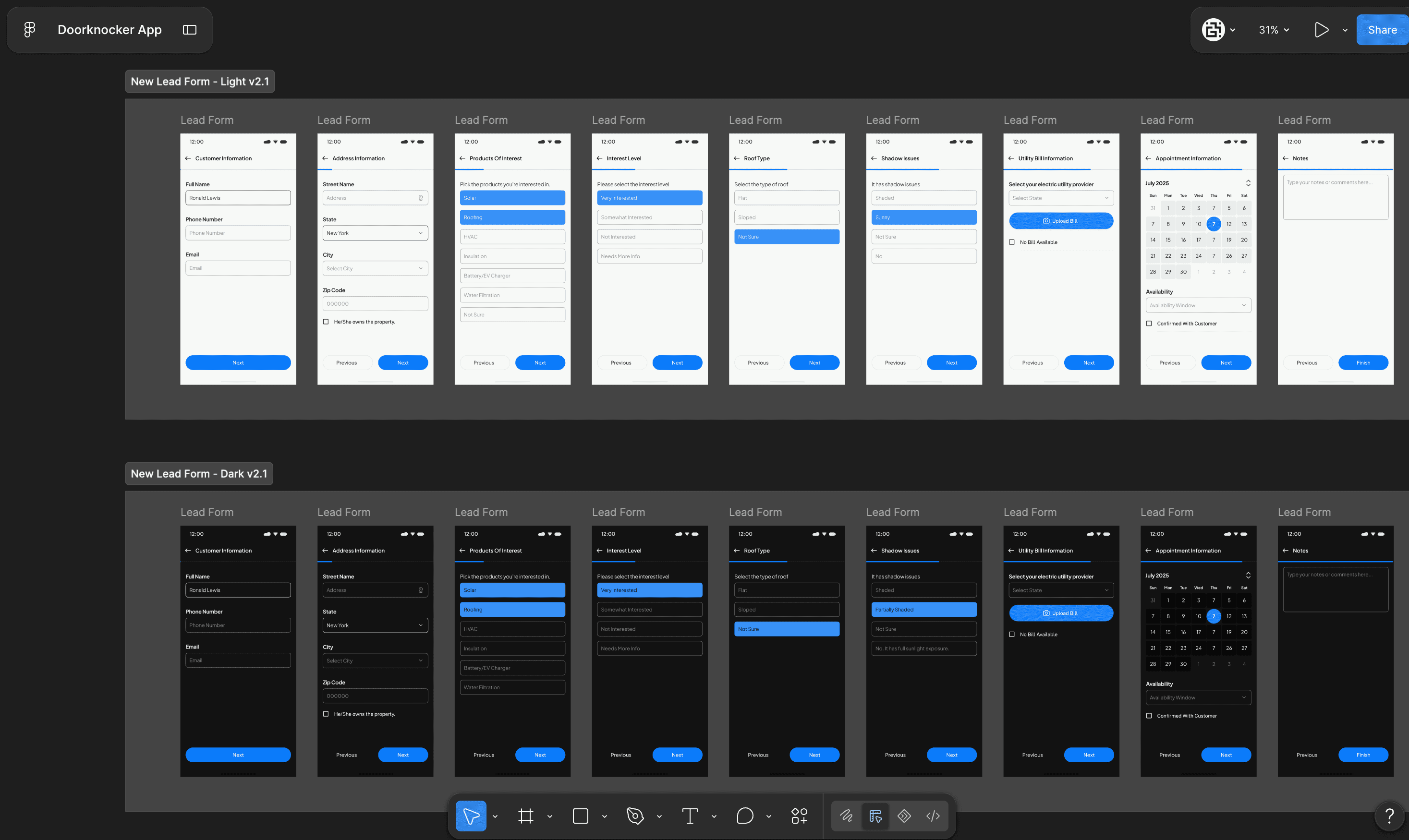
Interface of the 'Add New Lead' flow in light and dark modes.
HEA Form · Energy Audit
The form used by specialists when they visit a home to assess its energy conditions.
The information is later used by engineers to prepare a technical proposal: solar panel installation, roof thermal sealing, HVAC, or geothermal solutions.
It is a long, technical form covering insulation, HVAC, hot water, air sealing and ducts, thermostats, lighting, appliances, health, and safety. It is completed inside someone else's home, sometimes in an attic or basement.
We designed both web and mobile versions, using the same data structure but different priorities: the web version was designed for reviewing and completing information, while the mobile version focused on capturing data on site.
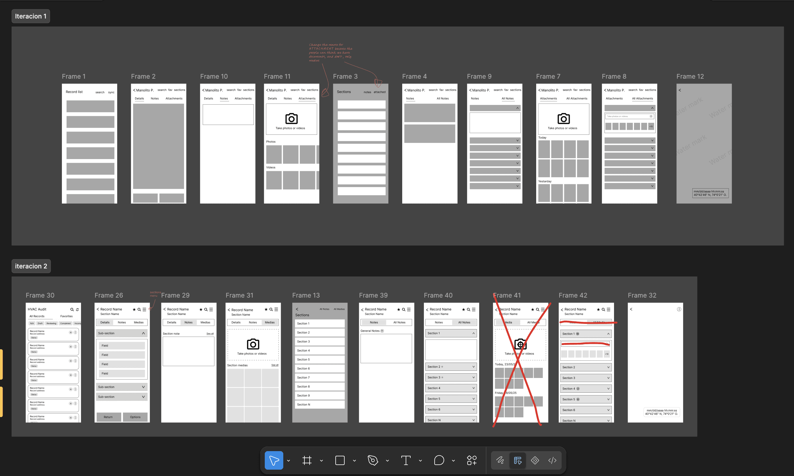
Iterations on the form structure.
How Decisions Were Made: Competing Proposals
Without access to users, the team needed a way to resolve disagreements that did not rely on persistence or hierarchy.
We adopted a simple approach: place the alternatives side by side, explain the reasoning behind each, and decide from there.
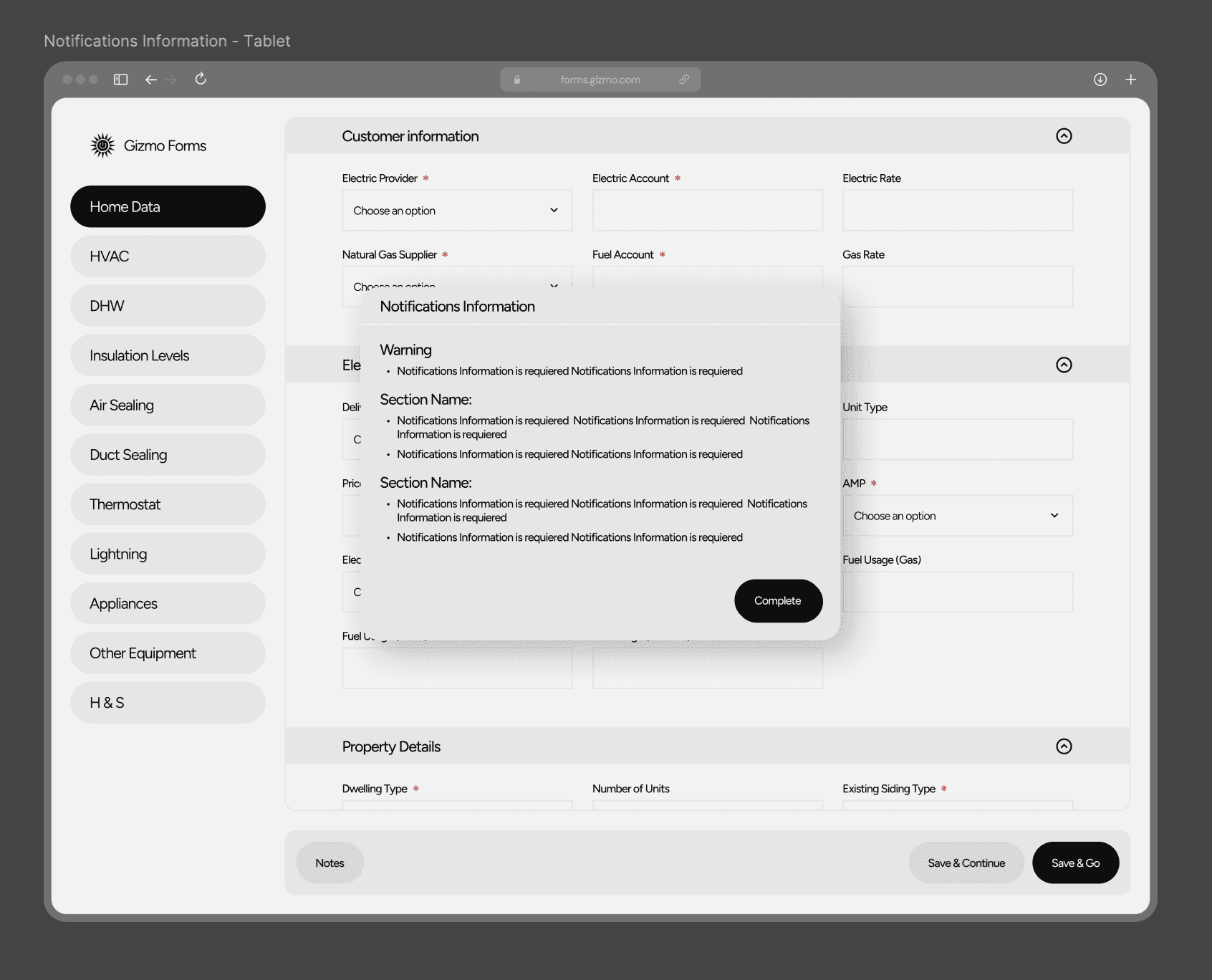
HEA Web Form. Low-Fidelity Prototype. Desktop version notification screen
When the stakeholder requested a specific solution and we believed another would work better, we built both.
When different designers had different ideas for the same objective, we built both.
And when there was simply no way to know which one would work, we built both.
It was not a test. Nothing was measured.
It was a way to make the conversation happen around something concrete instead of descriptions. Very often, the final decision became a combination of both options —which was usually a sign that neither was complete and that seeing them side by side had helped us find a third one.

Example
The “Insulation Levels” section needed to allow users to add items from a long list.
A displayed the options within the form, pushing the completed content downward.
B presented them in a floating panel anchored to the control, keeping the existing content in place.
The second protected context; the first was more predictable.
Put side by side, the discussion took five minutes.
04
Working Within Someone Else's System
Working within someone else's design system
GIZMO's design system was built by the UI designer on the team. My role was to design within it, using and respecting its components across several products in the ecosystem.
Designing with discipline inside a system you did not create is a different skill from building one yourself —and it is a skill worth learning.
Complementary Strengths on the Design Team
I worked closely with a UI-focused designer: he brought layout and cross-platform visual design, while I contributed UX analysis and the reasoning behind each decision.
It was peer mentorship in both directions.
05
Validation
The company did not allow testing with end users. Decisions were validated through weekly review cycles with the stakeholder responsible for requirements and the development team responsible for implementation.
What this model gave us
Short, frequent feedback cycles, continuous alignment with business priorities, and technical feasibility verified before the design was finalized.
What this model could not give us
Evidence of real user behavior —we never knew where a salesperson hesitated while holding the form in their hands—, detection of problems the stakeholder did not perceive as problems, or improvement metrics.
That is why this case has none.
06
Learnings
Winning an argument is not the same as being right
Without data, winning an argument is not the same as being right.
It was the most frustrating part of the project and also the most useful lesson I took from it.
When evidence is unavailable, a well-reasoned proposal and a competitor screenshot can compete on equal terms.
That is not a problem with the people involved. It is a process problem.
The intermediary is not the user
The stakeholder had valuable, first-hand knowledge of the work, but he was still communicating his interpretation of the problem.
Without direct user input, that interpretation becomes impossible to challenge.
Asking for user access is a design decision
Today, I would frame it in terms of business risk, because that is the language in which these decisions are made.
Five salespeople for one afternoon cost far less than redesigning a screen that is used every day.
When you cannot measure, document the reasoning
When there is no data to support a decision, the minimum you can leave behind is why the decision was made and what information it was based on.
That makes it possible to revisit the decision later instead of defending it out of inertia.
Working within someone else's system changes how you look at systems
Using someone else's design system forces you to ask why each component exists before proposing a new one.