100% Digital Debit Card
Redesigning a banking product application flow that, by design, excluded half of its potential market.
Industry
Regulated banking
Role
UX Designer
Period
Sep 2025 – Feb 2026
team
Product team
TOols
Figma, Maze, Confluence
Reading time
8 min
In summary
The institution faced a generational transition: only 28.6% of its customer base was between 20 and 35 years old, while just 1.8% of the overall market perceived the institution as modern.
I led the full discovery process —283 survey responses and 30 qualitative interviews, including field research— to understand what this segment was looking for in a digital financial product.
Research revealed something that was not part of the original brief: the product could only be requested by people who were not already customers. Existing customers were excluded from their own bank's digital product. I proposed expanding eligibility, and the proposal was approved.
Across prototype iterations, the misclick rate dropped from 62% to 34%, while the non-customer onboarding flow reached 95.8% task success with 118 participants.
01
Context & Problem
A Dominican savings and loan association wanted to launch a 100% digital, interest-bearing debit card. The motivation was not technological but demographic: its customer base was aging, and the institution was struggling to connect with younger adults.
Two figures defined the problem: 28.6% of customers were between 20 and 35 years old, while 71.4% were over 35. And only 1.8% of the overall market perceived the institution as modern.
A digital product alone was not going to solve that. First, I needed to understand what “modern” actually meant to this segment.
The constraints
This project was not designed on a blank canvas. The experience had to comply with Dominican banking regulations covering digital onboarding, anti-money laundering, due diligence, and KYC and FATCA requirements. Every field in an account-opening form responded to a legal obligation, not a design preference. The application also ran on a third-party platform, which limited what could be changed.
The product also had to serve two audiences —existing customers and non-customers— with different starting points and verification requirements.
A 100% digital card with tangible benefits and a simple experience motivates users to get it and use it.
Discovery starting hypothesis
02
Research
I structured the discovery process into three phases —understanding, validation, and concept— with roles, methodology, and a timeline defined from the start. All documentation was centralized in Confluence.
Study sample
Technique | Sample | Profile |
|---|---|---|
Quantitative survey | 283 | Customers, 18–40 |
Qualitative interviews | 30 | Customers and non-customers, 25–35 |
Prototype testing | ~350 | Across 10 Maze studies |
The interviews were conducted iteratively: the interview guide evolved after response saturation so that each round could go deeper into the questions raised by the previous one. Field research took place in high-traffic locations and branches in Santiago.
Findings
The survey showed that 96% wanted full control over their financial activity, 93% were looking for peace of mind and security, and 86% felt modern when using a digital solution.
The interviews revealed what the survey could not: users were not satisfied with features alone. They were also looking for social and symbolic value —control, operational trust, and transparency— as well as tools that allowed them to manage their finances independently and without friction.
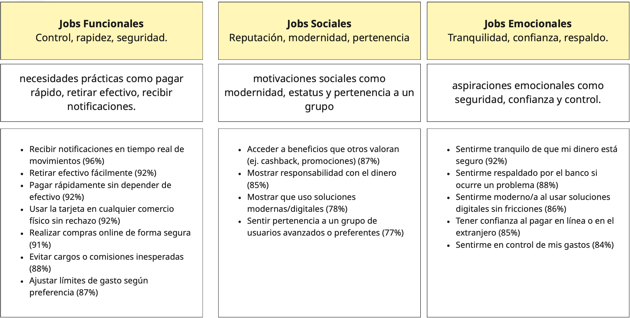
Jobs to be Done organized into three layers—functional, social, and emotional—each with its percentage of support in the survey.
I organized these motivations into three layers: functional, social, and emotional. This was the piece that helped stakeholders understand that we were not just designing a card, but a relationship with money.
The finding that changed the scope
The branch-based process created the same frustrations for customers and non-customers.
That finding challenged the original premise. The product had been conceived as an acquisition channel: only non-customers could apply for it. But the research showed that existing customers —people who already trusted the institution— experienced the exact same friction and could not access the digital product without going to a branch.
This was not a usability problem. It was a portion of the market that the product excluded by design.
I proposed expanding eligibility to existing customers, supported the proposal with the discovery data, and presented it to stakeholders. It was approved.
03
Design Decisions
Journey AS IS → TO BE
Journey moment | AS IS | TO BE |
|---|---|---|
Discovery | Information scattered across multiple channels | Everything in one place |
Onboarding | Long, with many clicks and many data fields | Less data, less paperwork, more intuitive |
Application | Required to be completed at a branch | Short online form with trust-building messages |
Usage | Physical card at points of sale | Mobile payments |
Reducing fields without breaking compliance
The natural impulse was to remove fields. But many of them were required by due diligence and KYC regulations and could not be negotiated away.
The decision was not to fight the regulation, but to reorganize it: group fields by affinity, sequence them according to the mental effort they required, and explain within the flow why each sensitive piece of information was being requested.
We gave up a shorter form. We gained one that feels shorter because it is easier to understand.
Designing for trust, not just screens
93% of participants were looking for peace of mind, and 88% wanted to feel supported by their bank if something went wrong.
That could not be solved with layout alone. I introduced explicit messaging around security and support at the points of highest anxiety in the flow, especially during OTP validation and the submission of personal information.
The perceived security of the process scored 6.8 out of 7 (n=23).
One flow, two entry points
Customers and non-customers arrived with different information already verified. One option was to build two separate flows.
I chose a single flow with an early branch: existing customers could skip the steps for information the bank had already verified.
We gave up implementation simplicity. We gained a single experience to maintain and a consistent product message.
Validating the architecture before the interface
Before discussing visual design, I tested the structure of the product page through a card sort (n=18): 100% agreement on the categorization of the six sections, and 67% said that none of the sections was unnecessary.
The same study revealed an uncomfortable finding: 17% considered the header unnecessary or repetitive. And during the five-second test, several participants said their attention was drawn to a secondary banner instead of the main message; one described the colors as “a little odd and unpleasant to look at.”
That forced us to rethink the visual hierarchy at the top of the page.
It was the decision I found hardest to defend, because the design had already been internally approved.
04
Solution

The redesigned application flow. The branch occurs early: existing customers do not need to resubmit information the bank has already verified.
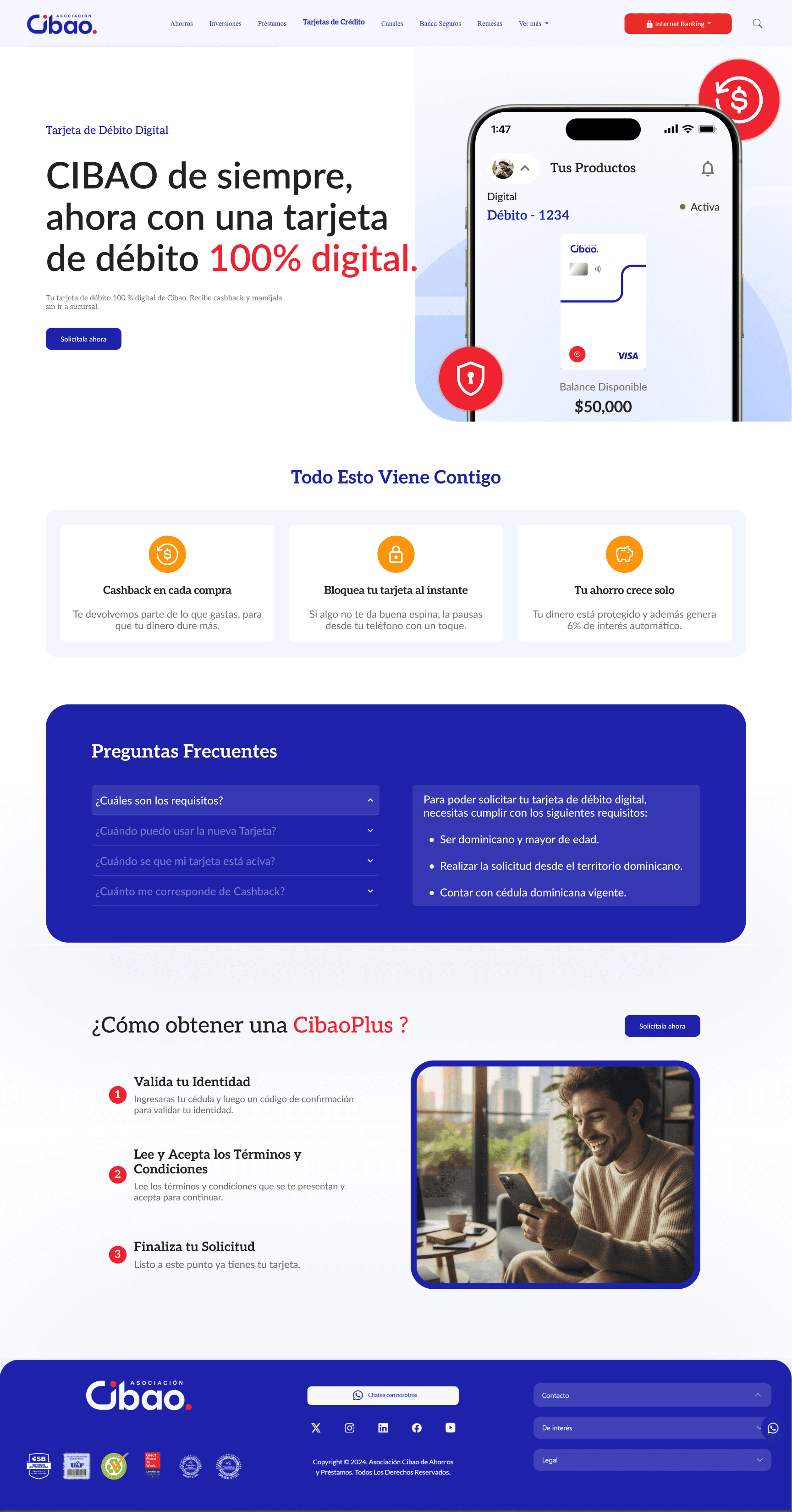
The product page. Its structure was validated through card sorting before moving into interface design. The visual hierarchy at the top was reworked after the five-second test.
05
Results
Prototype testing with Maze
Test | Date | n | Success | Abandonment | Misclicks |
|---|---|---|---|---|---|
Flow v1 | Nov 2025 | 20 | 70.0% | 30.0% | 62.7% |
Flow v1 (repeat) | Nov 2025 | 21 | 71.4% | 28.6% | 60.4% |
Flow v2.0 — acquisition | Feb 2026 | 25 | 100% | 0% | 34.2% |
Flow v2.0 — savings account | Feb 2026 | 100 | 84.0% | 16.0% | 41.4% |
Non-customer onboarding | Feb 2026 | 118 | 95.8% | 4.2% | 48.1% |
Participant perception (n=23, 1–7 scale): ease of completing the application 6.8 · clarity of instructions 6.6 · perceived security of the OTP process 6.8
What wasn't measured
The MVP launched in a controlled environment, where several opportunities for improvement were identified for future iterations. I was not involved in that stage, so I do not have production behavior data.
06
Learnings
The most valuable finding was not in the question. We set out to understand what motivates someone to get a digital card. We found that the product excluded half of its potential market by design. Research objectives define the scope of the work, not the limits of what you can discover.
Regulation is a design constraint, not an obstacle. Mandatory fields cannot be removed, but you can design how they are requested, in what order, and with what explanation. Most of the friction reduction came from those decisions.
A 34% misclick rate is still high. The flow went from 62% to 34%, which is a substantial improvement, but a third of participants were still clicking where they should not. I am leaving that here because it is true —and because it was the next problem to solve.
Document while you research, not afterward. Centralizing the entire discovery process in Confluence made it possible for the team to trace the origin of each decision months later.